Mountain Antennae
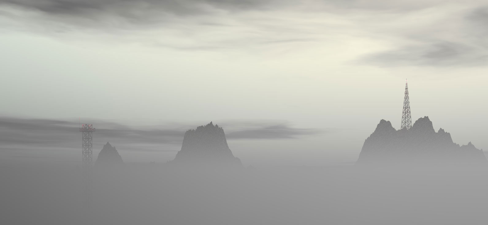

I've always had a fascination with the way that radio towers are placed atop hills and mountains in the Appalachian ranges, and this picture was an attempt to capture that. I think it turned out really well, especially with how the fog obscures the bases of the mountains.
Loss 2
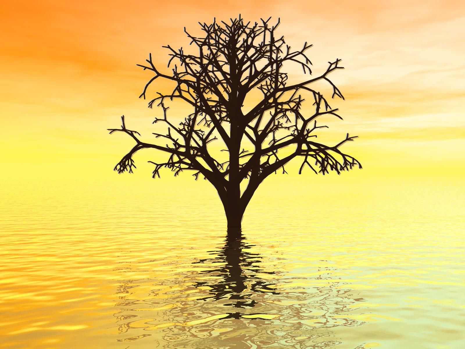

This is a remake of perhaps my most popular image ever, Loss. The original version was done in Bryce 2.0, way back in 1998 when I was first learning how to do renderings. Unfortunately, since I lost the original scene file, I had to recreate this from scratch in order to get a higher-resolution version.
The original tree was pre-fab, which was why it was so low-resolution, but this one I created custom. Just getting the branches to look right took hours, and trying to come up with a comparable sunset in the newer version of Bryce also wasn't easy. In the end, I couldn't get the colors right in Bryce alone, so I had to do a lot of color correction in Photoshop (darkening the tree and its reflection, and increasing the saturation of the oranges and yellows). The effect of luminescence around the branches was also something that I needed Photoshop in order to accomplish.
Even with all this work, though, I'm not certain that I recaptured the feeling of the original. I think the clouds in the background still might not be as vivid, and the colors might not be quite right. But, in all, I think this was a successful revisit -- the water effects are particularly improved.
4 comments:
In Loss 2 you nailed it. The clouds are fine the way they are. The eye is drawn immediately to the tree, which looks real. Then down to the complexity on the surface of the water---absolutely perfect. Adding interest to the sky will only draw the eye away; I think you should leave this exactly as it is. You're done. Brilliant job. I won't ever tire of looking at it.
Glad you like it! Thanks for letting me know what you think.
I love Loss 2.
It's fantastical, but it looks almost photorealistic. Some of the most effective surrealism is like that.
Thanks, Chandra! That means an especially large amount coming from an artistic guru like you!
Post a Comment