The reaction to last week's video and screens was mostly positive, particularly when folks saw shots reflecting the actual in-game resolution, but there were common concerns about the buildings, the character's running animation, the white borders around some graphics, etc. Well, all those have changed drastically this week, as you can see in the video above. There are also a whole new batch of screenshots on the AVWW page, replacing the old ones.
The screenshots have a very slight bit of JPEG distortion -- they look crisper in-game -- but it's very near what you'd see.
Plants, Ground, Sky, Etc
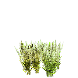
As you can see from the video, the game looks its very best in motion, with all the plants moving around, clouds moving, and so on and so forth -- you really get a sense of being outdoors in the wild woods and fields like what I grew up hiking through in North Carolina. That's not something I've seen represented in any other game I've played, so that's exciting to me.
In terms of these aspects, the game is probably about finalized on its style, which I'm excited about. Now it's time to really crank out more content and more variety for the plants, to give variety. Right now it looks cool, but there's only about 8 different trees and maybe 12 kinds of smaller grasses and bushes, so there's a limit to how many different scenes we can do.
By alpha, I hope to quadruple those numbers at the very minimum, and ideally it will be even more than that. A lot of the planets will of course be somewhat special-case-y: desert scenes, fully snowbound scenes, etc. But hopefully at least 2/3 of them will be versatile enough to be combined and reused in all sorts of different and interesting ways to provide lots of interesting compound effects. So far so good.
Buildings
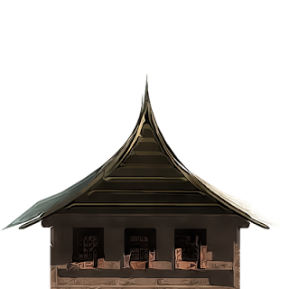
 The way that we're going about creating buildings is really different from what I'd previously thought we would do. I experimented with many different things, but at the high resolution and level of painterly realism that we're supporting, it's just not possible to do buildings piecemeal, built up from smaller component parts that are fully interchangeable.
That's a hallmark of building interiors, of course -- everything from Diablo to Demon Stalkers on up all use that technique for interiors, and we definitely will be, too. Being able to have customer, user-definable, quasi-dynamic floorplans is a key feature of this game.
I'd hoped that I'd be able to do the exteriors with a similar level of flexibility, as I had previously done with Alden Ridge back in 2008, but moving from 28px tiles to 64px tiles and going from a retro pixelart look to a unique painterly look has included a lot of adjustments for me for creating believable exteriors. Since that was to be the greatest artistic challenge for the game, that was my first focus -- no sense putting off the hard stuff.
When it comes to buildings, therefore, what I've settled on is doing each building more or less from whole cloth -- it's a unified image that can't really be tiled or combined in most cases. This allows for the awesome painterly HD look you see there, but it comes with a loss of flexibility in the art for building exteriors. That's okay, in the end, because it's just eye candy rather than functional, anyway. And I'd rather have less art that looks really good, rather than a ton of art that looks like the office building did last week (that was never more than a super early prototype, by the way).
This in turn adds a really immense load to the artwork, however. I've been doing building modeling for my art for years, but doing just a single model even at fairly low resolution can take me 1-4 hours depending on the type of model. There's just no way that I'd be able to meet my goal of having hundreds of different buildings if I tried to build every last component myself from scratch, as fun as that is.
The solution? I'm now using purchased 3D models for a lot of the detail stuff. These are not custom-built for this game, which means that they come very inexpensively. But the end result is very unique, because by the time I've scaled, positioned, lit, (often) re-textured, (sometimes) chopped up and rearranged, (occasionally) animated, and (always) heavily postprocessed each building, I get a really unique look that fits for this specific game and this game alone. That cuts my time per building down to between around ten to sixty minutes per building, which is a massive improvement. And it lets me get a really awesome result like you see here, without spending much or delaying or derailing the project.
 Characters
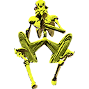
I had hoped to do a second playable character for this week, but all I wound up with was the new robot (an enemy that looks kind of like a nightmare C3PO), and fixing the first character's animation. That required just rendering another 5 frames per side in Poser, and then I also improved the saturation and vibrancy of him, too.
In terms of the robot, I also did him in Poser, and gave him his freaky skittering walk in that program directly, too -- I didn't know I'd be able to get such an unusual movement style in Poser, I thought I'd have to resort to Mudbox for that in more cases than apparently I'm going to. So that's pretty cool! I used Poser 4 a lot back in the day, but Poser Pro 2010 is new to me and the UI is a bit daunting. I'm getting way faster with the characters, though, which is a good thing -- hopefully next week I'll have even more to show in that category.
Spells And Particle Effects
So we have our first two spells in the game now -- thanks to Keith! While I've been working on the art and a little bit of programming, Keith has been really going at the code. This week is the first week where this game is actually a game in a literal sense, in that you can do more than walk around in the woods. That alone is pretty cool. :)
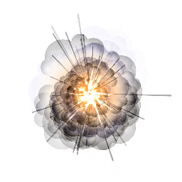
Particle systems are something we've done a bit with in AI War, and more with in Tidalis. However, because of the scale of the former, and the genre of the latter, we only did so much. Well, with AVWW, that all changes -- this game is going to be whiz-bang fancy with the particle effects, and in the last couple of days we've taken the first few steps on that road.

Particle Illusion is my go-to for rendering individual particles (animated or still), and then we're using procedural animation techniques in-game to create more interesting and dynamic compound effects. This is all stuff we've done in our other games, but here we're just going to be having a lot more particles and a lot more complex effects. Given the genre at hand here, and the closeness of the zoom, that's something we can really do to our hearts' content, unlike in the middle of a massive space battle or a puzzle game where the player is trying to concentrate.
Character Animations?
Here's a secret: one of the reasons that particle effects are so important to us for this game is that they will let us have a spectacular high-res display that dazzles and is fun, but without doing much in the way of character or minor monster animations.
As I noted above, our work with the particle effects is just beginning -- those are going to be a lot more prominent with spells, but also with even things like melee effects. It's a trick a lot of Anime TV shows use to save on animation time, and it's something we can put to use for ourselves, too, we decided. Funnily enough, the result actually looks better in a lot of cases thanks to the flashy effects.
In return, this lets us have a vastly greater diversity of playable characters. This is important for a game like this, in which any NPC can be a fully-playable character. In your average RPG, you have maybe 6 to -- at absolutely most -- 12 player characters to animate. In your average adventure game, in the Japanese flavor anyway, you have usually one. Then all those NPCs that you meet are just having very small animations for standing, walking around, and maybe talking if it's a AAA budgeted game.
That sort of concentration of animations just wouldn't work here, though -- all of our NPCs have to have just as many animations as a player character, because they are all player characters. That could quickly get ridiculous in terms of the production time, and would make adding more characters prohibitively expensive to do. Since I don't want to have a massive adventure game with only four or five characters running around, that's a big problem, no? How is an indie to solve this problem?
Particle effects is what we settled on, drawing inspiration from the likes of Dragon Ball Z on television. All those cool particle effects? Well, they draw the eye for one thing, and for another they actually obscure the world a bit, too. In Tidalis or AI War that was a bad thing -- you have to see to play. Actually, that's true here, too -- you have to see the field and what you're doing.
However, what you don't need to see, at the instant the spell is cast or the melee attack is launched, is your character. In a brief poof of particles, your character takes some action that is clearly conveyed on screen without being directly shown.
Thus we can get away with rendering "only" 39 frames and 1 portrait for each NPC, and a similar amount for most of the smaller monsters, instead of 10x or 12x that for having swiping/hit/grab/open/etc animations that you'd normally have. And you know what? This is critical, because even with just those 39 frames, the Darrell character is half a megabyte on disk, and the robot is about 750 kilobytes.
If we have sixty plus characters, as I'd ideally like to by 1.0, and a few dozen monsters, then that's a very nontrivial amount of disk space. If we multiplied that by 10x or 12... that wouldn't work at all, because not only would it take too long for us to create, but nobody would be able to download it. It's even worse in terms of RAM, because for things like characters we can't compress the in-memory textures due to quality degradation. So that half meg for one character suddenly becomes two megs of system and video RAM.
As with most large games with a lot of content, we'll be loading and unloading content as needed to keep RAM in check while balancing the least amount of loading times, but the particle effects help us there, too. By keeping the number of unique-per-monster-or-character frames to about 39, this makes loading times throughout the game vastly shorter (under ten seconds in all cases, if that, ideally -- right now it's one or two seconds max).
It also lets us cache certain commonly-used particles permanently in RAM, while just loading and unloading the more specific-case ones, which saves on loading times even further. Because our particle system is half-prerendered and half-pocedural, this gives us an enormous amount of flexibility while retaining that awesome look.
One thing you'll notice in the video is that the character actually isn't masked by the fireball at present -- that's because we don't yet have a "casting" animation in place to go along with the fireball itself. That's on the list for this next week. But the death poofs for objects and the robots do a pretty good job of illustrating the concept. Actually, the death-poof technique is widely used in even AAA games -- the 3D Zelda games spring immediately to mind.
Closing Remarks
 Every game has to work within some form of constraints. For most big-budget games, the constraints boil down to "we can only fit this much content in RAM, and we can only afford to make this much content in the first place." That leads to things like worlds only being able to be so large, etc. The really clever game studios are able to twist that formula around and do more with less.
Look at the earlier versions of World of Warcraft: they had very low-polygon models with incredibly textures on them, and not only did that help with their minimum system requirements, it also helped with making a convincingly massive MMO.
Look at all the SNES-era RPGs. Final Fantasy 6 had a system whereby the individual player characters had walking and standing poses, as well as striking poses (side view only), and a few facial expression poses (front view only), along with a very few others. In the context of a 32bit SNES cartridge, that was still a lot of memory capacity used to create 12 main characters and several equally-animated NPCs (like Kefka). For doing the actual attacks, they then had various weapon or magic effects that would appear in space in front of the character, while the character struck their striking pose.
The result with FF6 wasn't what FF13 has with fully-rendered 3D, but to me it was a much more compelling game (and longer and more varied, I might add). That's what we're going for here, too: a ridiculously compelling experience with as much immersion as we can give you under the constraints we have. It all comes down to being tricky with how we create and use all of our assets, rather than just throwing a hundred artists at the job.
If you think the bump in quality between last week's video and this week's video was crazy, I can promise that the difference between even this week's video and alpha will be pretty staggering. When we have more of the content in there, along with more particle effects and more of -- well, everything in general -- I think the result is going to be something really attractive and unique, and something that people can be really excited about.
Perhaps I shouldn't be revealing the tricks of the trade as we're using them (it's a bit "how the hotdog is made," perhaps), but I wanted to explain how we are going to achieve what we're setting out to do. With one artist on staff (me) working about half-time on art (the rest on programming, design, business stuff, etc), we're going to make one of the bigger and more varied action-adventure games around. This post explained a lot of how we're able to do that, and why we aren't crazy to even attempt it!
Stay tuned!
14 comments:
"Perhaps I shouldn't be revealing the tricks of the trade as we're using them"
No, please, keep doing that. I have learnt a lot from your posts.
The AVWW looks great now, I can't wait to try it.
I have a technical question if you don't mind. Why have you decided on using 3D characters? It seems to me that 2D sprites would allow for a lot more flexibility, especially in randomization of their look.
Oops, I commented on the wrong post :p
The wind effects on the trees look amazing and I'm eager to see what else you can add.
Thanks as well for sharing all the information about your art pipeline, it is very helpful for people like me who want to create games too :)
I'm definitely a gameplay over graphics guy so I was already hooked on the idea of AVWW, but man, what a remarkable visual improvement from just a week ago!! That's seriously some fantastic work, I can really see the "Painterly" look you've described, and I think it looks great.
So, this is actually a serious question even though it sounds like I'm playing word games, but I have a question as far as things "Moving in the breeze", etc, given that the title of the game is "A Valley Without Wind". Is the title poetic or literal, i.e. there isn't any wind? If so, how are things blowing around? Trivial I know, but I've just been curious.
Note: as should be obvious, I know very little about the game world / lore.
:D
mlaskus -- Thanks, I'm glad it's been really helpful. :)
In terms of the 3D characters, they are being rendered to 2D sprites and post-processed, etc. That's why the number of frames is particularly important there, as each one is a different image texture in the traditional 2D manner.
That aspect is actually one of the bigger limiting factors in many respects -- fully-3D models is why a lot of more recent games are able to have more expressive characters in the first place -- but it's freeing in others. With doing the 2D sprites, we can have much more detailed, interesting prerenderings for the characters. On the flip side, doing them prerendered means that there is a severe limit on the number of animations we can include. Everything is a tradeoff.
As to why I start them off as 3D in the first place, it's for a few reasons:
1. I'm much better as a 3D artist than a 2D one.
2. It's way, way faster, because you model once, then pose and render 39 times. As opposed to drawing six times (standing x3, walking x3), and then having 33 more frames that are modified by hand to look correct.
3. I'm able to use prefab props for clothing, etc, and to then combine and alter those in custom ways. And with the characters, doing their face design in Poser is just second to none in terms of the ability to rapidly create new and interesting people. I haven't gotten into the Hair Room yet with Poser (part of why I started with Darrell and the robot, since both are bald), but I've heard good things.
In all, it's a mixture of mixing my particular skillset with the sort of visual result I'm going for, and doing so with the least amount of creation time and runtime RAM/CPU/GPU cost possible. With any project, given the team and the design goals, the specific pipeline that makes the most sense is going to vary widely. It's taken me since about mid-December to really perfect the pipeline that works the best for me, and that included a lot of research into new programs and tools that I wasn't familiar with. So it's always something that kind of evolves, and has to be figured out on an artist by artist (and game by game) basis. :)
7rigger -- Thanks a lot! Also glad it's useful, and that you like the effects. :)
EmperorPenguin -- Also thanks, and glad it's coming along to the point that others can appreciate what I was seeing in my mind's eye last week. Much preferred to what happened last time. ;)
In terms of the "A Valley Without Wind" as the title, that actually gets into one of the core mechanics of the game that we haven't talked about in TOO much depth. But basically, it's a very windy sort of world, with things moving in the wind and breezes all over the place outside, but even moreso with windstorms cropping up on the overworld map, and causing you to get lost and into really dangerous circumstances. I think one of the recent interviews talked about that in a bit more depth.
Those windstorms are a key mechanic of the game, and one of the reasons that overworld travel is so dangerous. As you explore around, you can make for safe travel between areas by erecting wind shelters to let you not get lost if you're on that sort of tile when the windstorm comes up. To fully explain that you'd have to see the overworld and such, but that's the general idea.
Anyway, so thematically "A Valley Without Wind" refers to a state of peace and safety which is really lacking in the world of this game. But as you explore around and help to improve the world, you actually are able to create pockets -- valleys, even, if you want to be poetic about it -- that have relative peace and safety.
So the title is a thematic thing referring to the way characters WISH the world was, rather than the way the world actually is. :)
Strangely, I can't seem to login on the forum right now. I haven't been active there for quite a while so I guess my account got deactivated.
I have re-watched the video and I have a few suggestions, where do you prefer to receive such feedback? I know you are reading and responding to people's posts in a bunch of places but I would prefer to use the one that's most convenient to you.
mlaskus -- Generally the forums are a lot easier for me to keep track of. I checked out your account and all seems to be well... so perhaps you just forgot the password? Not sure, but we don't have a timeout on user accounts. If you need help with a reset, just let me know.
Well, I keep my passwords in KeyPass so I definitely have the right one.
When I tried to login and failed, I reset the password but then when I tried to login I got redirected back to reset password screen.
I've tried it twice more to make sure that I haven't botched anything, the same thing happened and now I temporarily locked my account. ;)
Hmm, that's really odd. I reset your password and sent you an email. Hopefully that will solve it, but if not let's finish solving it via email instead of this. Thanks!
"of World of Warcraft: they had very low-polygon models with incredibly textures on them, and not only did that help with their minimum "
You accidentally a word. =D
Looks great!
I have but one bit of advice, and it is this: Add depth perception to the world.
At present, everything has the same general color depth to it. You can't tell what objects are in the foreground or the background, and there's no isometric feel to fool the eyes. Nothing stands out, and it feels flat.
Maybe that's what you're going for, but I would nonetheless recommend at least trying out various forms of y-position-based fog to give the illusion of an actual space, and to separate out, say, a tall green tree from the green grasses around it.
I am studying computer arts at Abertay University in Scotland, and we are assigned with creating a blog to show influence.
Would it be ok to link back to your blog and use images on my blog?
7rigger -- Sure, that's no problem.
Post a Comment